Caitie Kuempel, PhD
Post-doctoral researcher, Coral Reef Ecosystems Lab, University of Queensland
These materials were created by Allison Horst, PhD
Assistant Teaching Professor, Bren School, UC Santa Barbara
Topics
- Conceptual hierarchy of data viz
ggplot2basics review- Aesthetic mapping
- Themes
- Labels
- Facets (& facet grids vs facet wraps)
- Getting things in order (e.g. fct_reorder)
- Advanced customization in
ggplot2scalesfor thoughtful breaks and labels- …and color schemes (+
paletteer!) - In the weeds of themes (gridlines, panel colors, margins, etc.)
- Direct annotation (as an alternative to legends)
- Repulsive labels (e.g.
ggrepel) - Highlighting for clarity (e.g. with
gghighlight)
- Compound figures with
patchwork - A few new graph types to consider
- Marginal plot
- Beeswarm plots with
ggbeeswarm - Heatmaps with
geom_tile()
- Export & save your graphs
- Keep learning
Citations and data
R packages
tidyverse: Wickham et al., (2019). Welcome to the tidyverse. Journal of Open Source Software, 4(43), 1686, https://doi.org/10.21105/joss.01686ggplot2: H. Wickham. ggplot2: Elegant Graphics for Data Analysis. Springer-Verlag New York, 2016.ggrepel: Kamil Slowikowski (2021). ggrepel: Automatically Position Non-Overlapping Text Labels with ‘ggplot2’. R package version 0.9.1. https://github.com/slowkow/ggrepelgghighlight: Hiroaki Yutani (2020). gghighlight: Highlight Lines and Points in ‘ggplot2’. R package version 0.3.1. https://github.com/yutannihilation/gghighlight/R Markdown: Yihui Xie and J.J. Allaire and Garrett Grolemund (2018). R Markdown: The Definitive Guide. Chapman and Hall/CRC. ISBN 9781138359338. URL https://bookdown.org/yihui/rmarkdown.sf: Pebesma, E., 2018. Simple Features for R: Standardized Support for Spatial Vector Data. The R Journal 10 (1), 439-446, https://doi.org/10.32614/RJ-2018-009paletteer: See AUTHORS file. (2021). paletteer: Comprehensive Collection of Color Palettes. R package version 1.3.0. https://github.com/EmilHvitfeldt/paletteergapminder: Jennifer Bryan (2017). gapminder: Data from Gapminder. https://github.com/jennybc/gapminder, http://www.gapminder.org/data/, https://doi.org/10.5281/zenodo.594018.janitor:Sam Firke (2021). janitor: Simple Tools for Examining and Cleaning Dirty Data. R package version 2.1.0. https://github.com/sfirke/janitor
Lizard size measurement data
Our data are a curated subset from Jornada Basin Long Term Ecological Research site in New Mexico, part of the US Long Term Ecological Research (LTER) network:
- Lightfoot, D. and W.G. Whitford. 2020. Lizard pitfall trap data from 11 NPP study locations at the Jornada Basin LTER site, 1989-2006 ver 37. Environmental Data Initiative. https://doi.org/10.6073/pasta/4a6e258fb49c31e222ecbbcfd128967f
From the data package: “This data package contains data on lizards sampled by pitfall traps located at 11 consumer plots at Jornada Basin LTER site from 1989-2006. The objective of this study is to observe how shifts in vegetation resulting from desertification processes in the Chihuahaun desert have changed the spatial and temporal availability of resources for consumers. Desertification changes in the Jornada Basin include changes from grass to shrub dominated communities and major soil changes. If grassland systems respond to rainfall without significant lags, but shrub systems do not, then consumer species should reflect these differences. In addition, shifts from grassland to shrubland results in greater structural heterogeneity of the habitats. We hypothesized that consumer populations, diversity, and densities of some consumers will be higher in grasslands than in shrublands and will be related to the NPP of the sites. Lizards were captured in pitfall traps at the 11 LTER II/III consumer plots (a subset of NPP plots) quarterly for 2 weeks per quarter. Variables measured include species, sex, recapture status, snout-vent length, total length, weight, and whether tail is broken or whole. This study is complete.”
There are 16 total variables in the lizards.csv data we’ll read in. The ones we’ll use in this workshop are:
date: data collection datescientific_name: lizard scientific namecommon_name: lizard common namesite: research site codesex: lizard sex (m = male; f = female; j = juvenile)sv_length: snout-vent length (millimeters)total_length: body length (millimeters)toe_num: toe mark numberweight: body weight (grams)tail: tail condition (b = broken; w = whole)
Jornada vegetation spatial data
From Jornada Basin LTER Spatial Data: Dominant Vegetation of the JER and CDRRC in 1998 (Download KMZ 3972 KB) Dominant and subdominant vegetation on the Jornada Experimental Range and Chihuahuan Desert Rangeland Research Center in 1998. Published in Gibbens, R. P., McNeely, R. P., Havstad, K. M., Beck, R. F., & Nolen, B. (2005). Vegetation changes in the Jornada Basin from 1858 to 1998. Journal of Arid Environments, 61(4), 651-668.
Set-up
Get workshop materials
You can get the workshop materials in two ways:
- Clone the workshop repo from GitHub to work locally
- Create an RStudio Cloud account, and click HERE to get to the project. Make sure you click on ‘Make permanent copy’ so your updates & notes will be stored.
Create a new R Markdown document or R script
I will be working in R Markdown, but you can follow along in either an .Rmd or R script.
Attach R packages
# General use packages:
library(tidyverse)
library(here)
library(janitor)
# Specifically for plots:
library(patchwork)
library(ggrepel)
library(gghighlight)
library(paletteer)
library(ggExtra)
library(ggbeeswarm)
# And for another dataset we'll explore:
library(gapminder)
# Spatial
library(sf)
Read in the lizard data
lizards <- read_csv("lizards.csv")
ggplot2 Basics Review
First, we’ll cover some ggplot2 basics to create the foundation that we’ll make our great customized data visualization on.
The essentials
When we start creating a ggplot graph, we need three basic building blocks:
- We’re using
ggplot - What data we want to use in our graph
- What type of graph we’re creating
For example:
# ggplot essential pieces, 3 ways (that do the same thing):
# Like this:
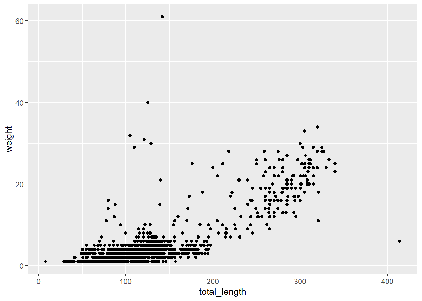
ggplot(data = lizards, aes(x = total_length, y = weight)) + # That's 1 & 2
  geom_point() # That's 3
# Or, alternatively:
ggplot(data = lizards) +
  geom_point(aes(x = total_length, y = weight))
# Or another way:
ggplot() +
  geom_point(data = lizards, aes(x = total_length, y = weight))
Which all produce the same thing:
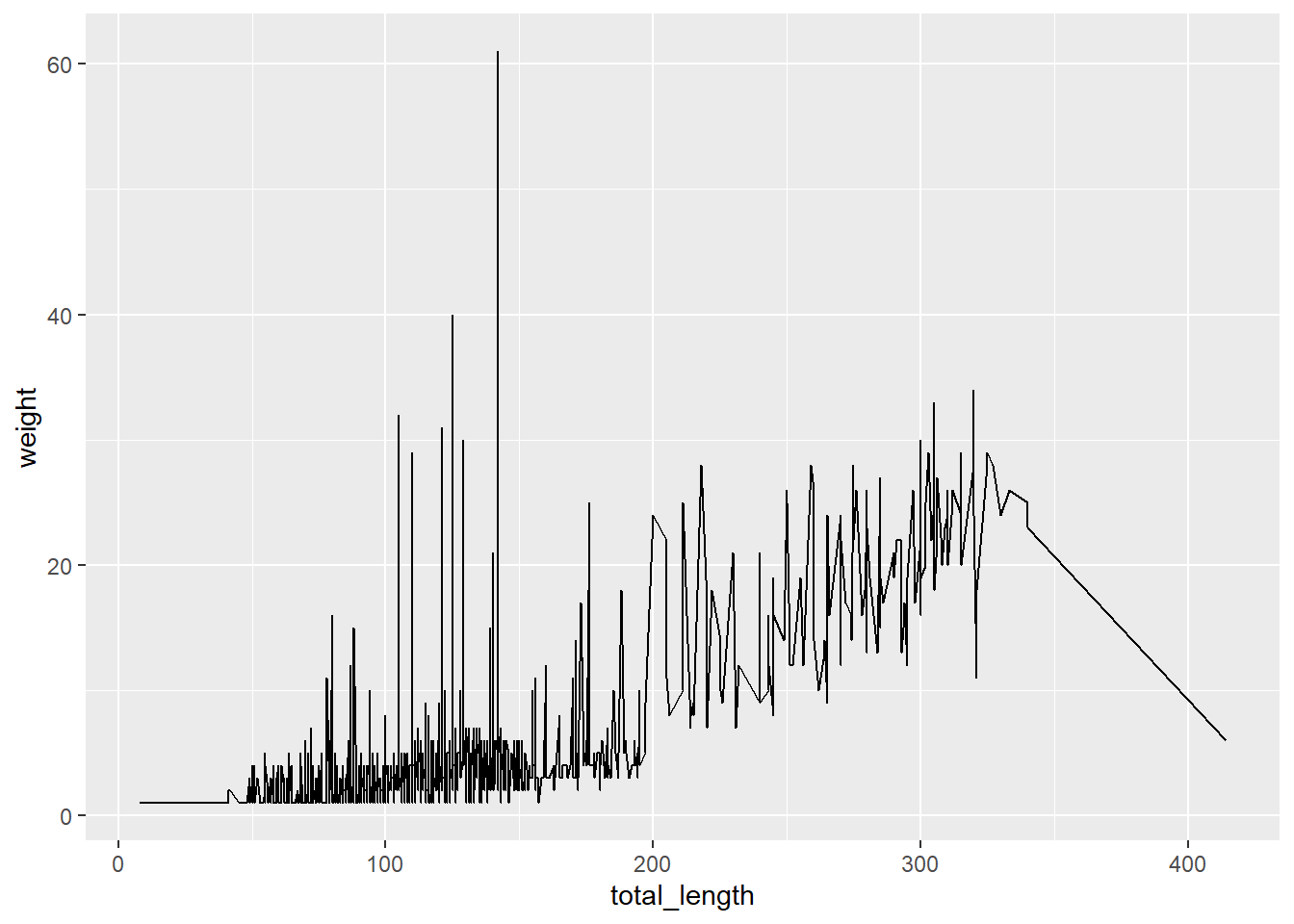
Which makes changing graph types straightforward by updating the geom_:
ggplot(data = lizards, aes(x = total_length, y = weight)) +
  geom_line() # Bad idea, just demonstrating a geom switch.
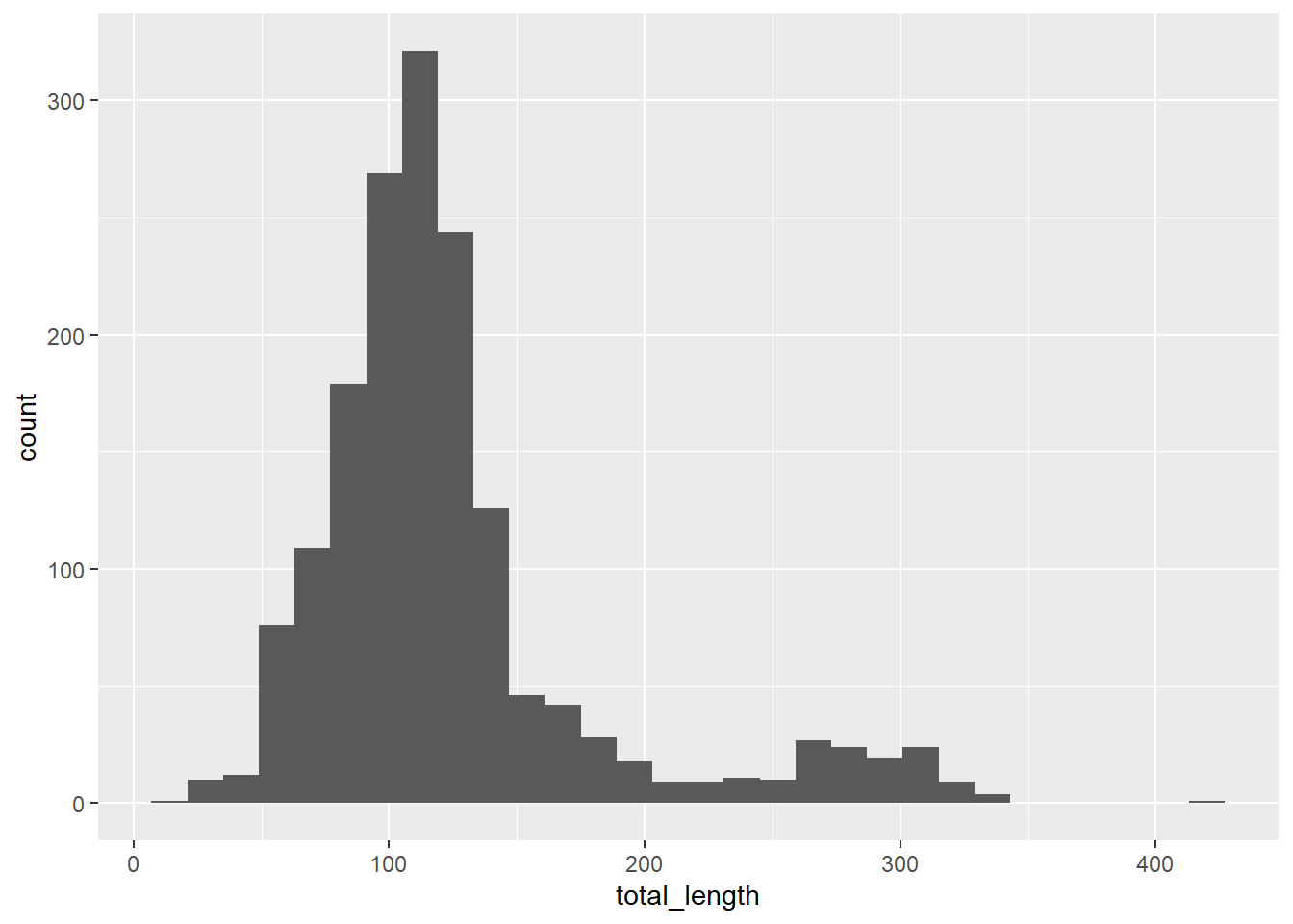
Keep in mind that some graph types only require one variable - for example, geom_histogram:
ggplot(data = lizards, aes(x = total_length)) +
  geom_histogram()
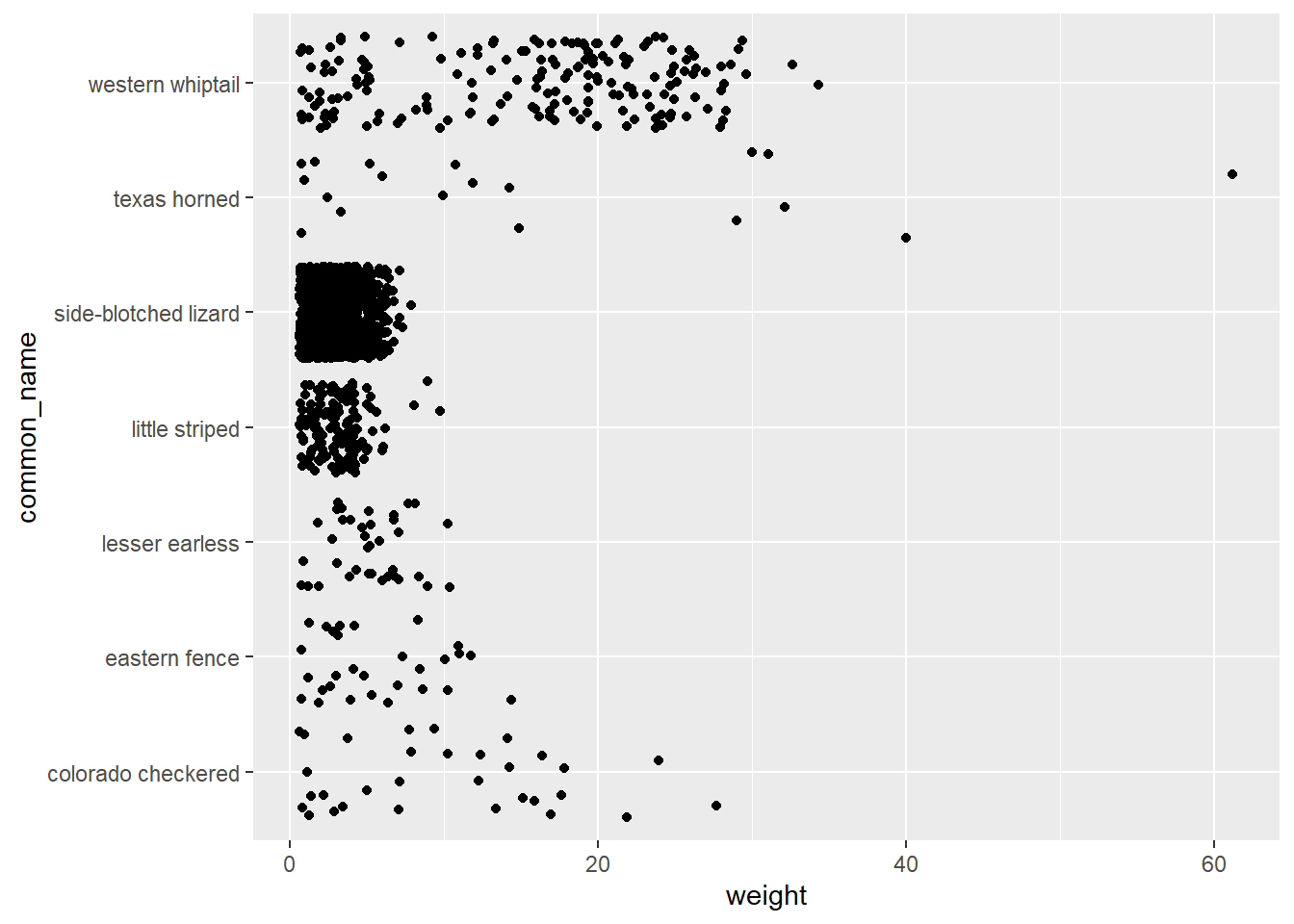
And remember to carefully consider the type of data you’re trying to visualize, which will help to direct the graph type. For example, a jitterplot usually has one categorical variable and one continuous variable:
ggplot(data = lizards, aes(y = common_name, x = weight)) +
  geom_jitter()
Not sure which type of graph is appropriate for your data? My favorite resource is Yan Holtz' From Data to Viz - check it out, it is fun and amazing, and links to code examples from the R Graph Gallery.
Aesthetic mapping
Updating based on a constant? NO aes()!
To change aesthetics of a graph based on a constant (e.g. “Make all the points BLUE”), we can add the information directly to the relevant geom_ layer. Some things to keep in mind:
fill: updates fill colors (e.g. column, density, violin, & boxplot interior fill color)color: updates point & border line colors (generally)shape: update point stylealpha: update transparency (0 = transparent, 1 = opaque)size: point size or line widthlinetype: update the line type (e.g. “dotted”, “dashed”, “dotdash”, etc.)
If you are updating these by referring to a constant value, they should not be within an aes().
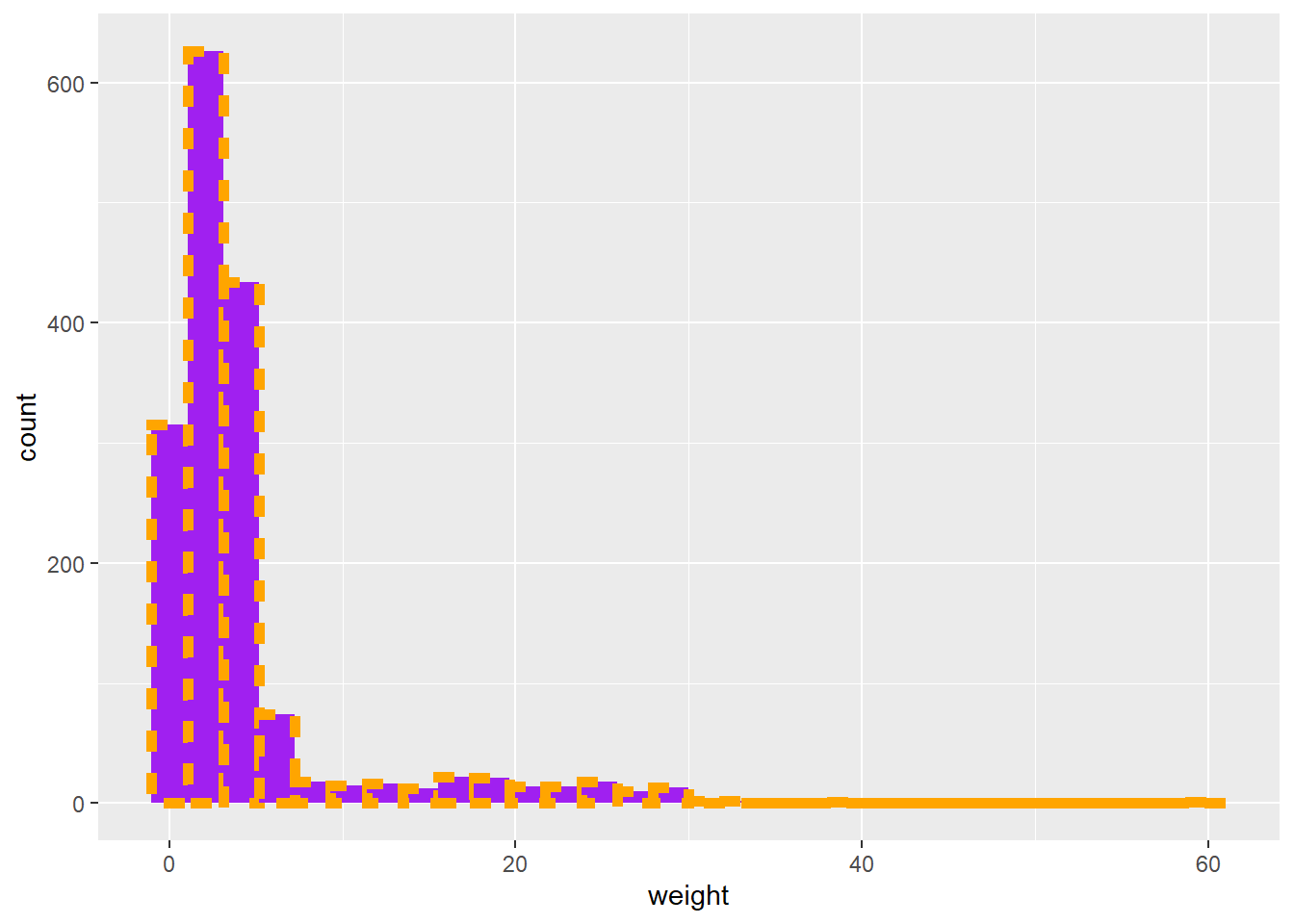
For example, let’s make some nightmares:
ggplot(data = lizards, aes(x = weight)) +
  geom_histogram(color = "orange",
                 fill = "purple",
                 size = 2,
                 linetype = "dotted")
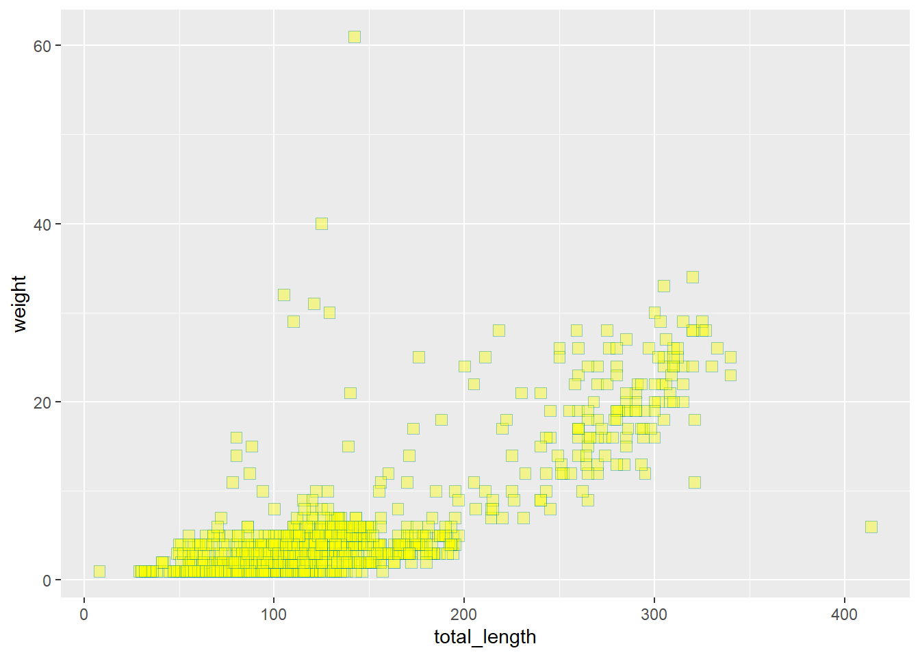
Some shapes have both a fill and color aesthetic:
ggplot(data = lizards, aes(x = total_length, y = weight)) +
  geom_point(color = "cyan4",
             fill = "yellow",
             shape = 22,
             size = 3,
             alpha = 0.4)
Updating an aesthetic based on a variable? YES aes()!
If you want to map a variable onto a graph aesthetic (e.g., point color should be based on lizard species), put it within aes().
ggplot(data = lizards, aes(x = total_length, y = weight)) +
  geom_point(aes(color = common_name, size = total_length))

These can be used in combination. For example, if we want the color to be based on species, but the transparency for all points is 0.3:
ggplot(data = lizards, aes(x = total_length, y = weight)) +
  geom_point(aes(color = common_name), alpha = 0.3)

Themes
Quick reminder: yeah there are some built-in themes you can add with + theme_*().
A few useful baselines are:
theme_minimal(): minimal themetheme_bw(): also pretty good for some stufftheme_light(): a nice light one
ggplot(data = lizards, aes(x = site, y = weight)) +
  geom_jitter(aes(color = common_name)) +
  theme_minimal()

Axis labels
For basic axis labels, I recommend labs():
ggplot(data = lizards, aes(x = total_length, y = weight)) +
  geom_point() +
  labs(x = "Total length (mm)",
       y = "Weight (grams)",
       title = "Lizard size")

We’ll learn a few more advanced label skills later on.
Facetting
Sometimes it’s useful to split up information in a graph into separate panels. For example, maybe we want to have a separate graph of total length versus weight for each lizard species. That would be really tedious to create them all manually from subsets. Instead, we’ll facet by distinct groups within a variable.
We’ll learn two ways to do this:
facet_wrap(): the one where you give it one faceting variable and the panels get wrapped into a gridfacet_grid(): the one where you make a grid based on row & column faceting variables
For example, let’s say we just want each species to have its own panel. Then we can use facet_wrap():
ggplot(data = lizards, aes(x = total_length, y = weight)) +
  geom_point() +
  facet_wrap(~common_name, ncol = 3, scales = "free")

But what if we want to make a grid where the panels are split across groups by lizard sex and if it has a broken tail or not? Since we have two variables being used to create our grid, we’ll use facet_grid():
ggplot(data = lizards, aes(x = total_length, y = weight)) +
  geom_point() +
  facet_grid(sex ~ tail)

Getting things in order
ggplot loves putting things in alphabetical order - but that’s rarely the order you actually want things in if you have categorical groups. Let’s find some total counts of lizards in the dataset by common name, then make a column graph:
lizard_counts <- lizards %>%
  count(common_name)
ggplot(data = lizard_counts, aes(y = common_name, x = n)) +
  geom_col()

ggplot(data = lizard_counts, aes(y = fct_reorder(common_name, n), x = n)) +
  geom_col()

ggplot basics: synthesis examples
Example 1: A quick review of basics, including:
ggplotessentials- aesthetic mapping
- themes
facet_wrap&facet_grid- labels with
labs
ggplot(data = lizards, aes(x = total_length, y = weight)) +
  geom_point(aes(color = common_name),
             fill = "black",
             size = 2) +
  theme_minimal() +
  labs(x = "Total length (mm)",
       y = "Weight (g)",
       color = "Lizard species") +
  facet_wrap(~common_name, scales = "free")

Example 2: Reminders of position, facet_grid, and factor reordering
Let’s make a stacked column graph of lizard species by site:
# fct_infreq(): reorder factor levels by number of observations with each level (largest first)
ggplot(data = lizards, aes(y = fct_infreq(common_name))) +
  geom_bar(aes(fill = site)) +
  theme_bw() +
  labs(x = "Lizard counts",
       y = "Species (common name)") +
  facet_grid(sex ~ tail)

# That annoying space below zero? Let's keep that in mind...
Advanced ggplot2 customization
An unsung hero: scales
The scales package in R is truly an unsung hero of finalizing ggplot graphs. To hear more, I strongly recommend watching Dana Seidel’s 20 minute talk on The little package that could: Taking visualizations to the next level with the scales package from rstudio::conf(2020).
Why does that matter to us? Because a whole lot of the subtle things that make a graph way better are updating using the scales suite of helpful functions.
For a complete list of scales functions & usage, see: https://scales.r-lib.org/index.html
Thoughtful breaks, limits & labels
Little things make a big difference in data visualization. Just like we should take great care to make axis labels useful and complete, we also need to think about how values are communicated for our different variables.
In 2-D data visualization, that means customizing your breaks, limits, & tick mark labels & formatting. From Hadley Wickham & Dana Seidel: “The most common use of the scales package is to control the appearance of axis and legend labels. Use a break_ function to control how breaks are generated from the limits, and a label_ function to control how breaks are turned in to labels.”
Let’s explore some different ways to update breaks and labels.
Updating breaks & labels
The important thing: know what type of variable you have on each axis so that you know what scale_ version to call. For example:
- For dates:
scale_*_date() - For continuous variables:
scale_*_continuous() - For discrete variables:
scale_*_discrete()
Within those layers added to your plot, you can update the breaks = , limits = , labels = and expand = options.
ggplot(data = lizards, aes(x = total_length, y = weight)) +
  geom_point()

ggplot(data = lizards, aes(x = total_length, y = weight)) +
  geom_point() +
  scale_x_continuous(breaks = c(0, 250, 500),
                     limits = c(0, 500)) +
  scale_y_continuous(breaks = seq(from = 0, to = 70, by = 10),
                     limits = c(0, 70)) +
  theme_light()

But you can also do so much more! For example, you can convert to a log scale:
ggplot(data = lizards, aes(x = total_length, y = weight)) +
  geom_point() +
  scale_x_log10()

Explore the different options for label_* that appear once you start typing it in…you’ll see a bunch of different options. Make your tick marks currencies, scientific notation, or more - just by updating the labels within the correct scale_! Go ahead & try it out, it’s pretty amazing (and see the many different label options here: https://scales.r-lib.org/reference/index.html).
Customized aesthetics with scale_ functions
We’ve learned to use scales functions to update breaks and labels. It is also useful for updating aesthetics, for example to customize color gradients, set size bins, and more.
Again, it is very important to know what aesthetic you are trying to update.
For example, is it a fill aesthetic you’re hoping to customize? Then you might use scale_fill_*(). But if it is a color aesthetic, you’d use scale_color_*() functions. If it is the transparency, then scale_alpha_*(). If it is the shape, then scale_shape_*(). So make sure you know which aesthetic you are hoping to change with scales!
ggplot(data = lizards, aes(x = total_length, y = weight)) +
  geom_point(aes(color = weight)) +
  scale_color_gradient(low = "red", high = "navy")

# Or have more than 2 colors in your gradient:
ggplot(data = lizards, aes(x = total_length, y = weight)) +
  geom_point(aes(color = weight)) +
  scale_color_gradientn(colors = c("orange", "red", "purple", "navy", "black"))

# Or use a palette from paletteer!
# Check out options: https://emilhvitfeldt.github.io/paletteer/
# ggplot(data = lizards, aes(x = total_length, y = weight)) +
#   geom_point(aes(color = weight)) +
#   scale_color_paletteer_c("scico::oslo")
# See more continuous palettes with View(palettes_c_names)
There are also great options for binning colors for a continuous variable, including with the scale_*_steps() functions (see more: https://ggplot2.tidyverse.org/reference/scale_steps.html). For example, maybe in the graph above we want binned (instead of continuous gradient) color values:
ggplot(data = lizards, aes(x = total_length, y = weight)) +
  geom_point(aes(color = weight)) +
  scale_color_steps(low = "red", high = "black")

# Notice the binned legend - within bins all points are the same value.
# Use n.breaks =  or breaks = c() to manually set the break number or value.
You can create a divergent binned scheme with scale_*_steps2():
ggplot(data = lizards, aes(x = total_length, y = weight)) +
  geom_point(aes(color = total_length)) +
  scale_color_steps2(low = "green",
                     mid = "black",
                     high = "red",
                     midpoint = 150,
                     breaks = c(50, 75, 150, 180, 220, 280))

Or, to make your own bins, try scale_*_stepsn():
ggplot(data = lizards, aes(x = total_length, y = weight)) +
  geom_point(aes(color = weight)) +
  scale_color_stepsn(colors = c("orange","red","purple"),
                     breaks = seq(from = 10, to = 60, by = 10))

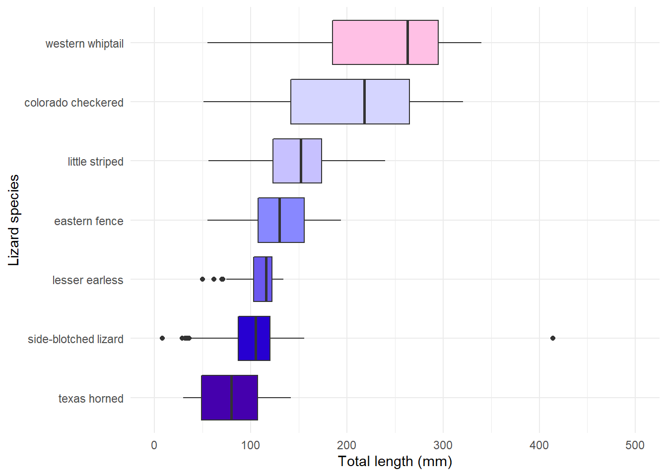
What if we have a discrete variable? Let’s make a boxplot of lizard lengths by species, then customize the fill color with a palette in paletteer:
ggplot(data = lizards, aes(x = common_name, y = total_length)) +
  geom_boxplot(aes(fill = common_name), color = "black", show.legend = FALSE) +
  theme_minimal() +
  coord_flip()

# But **order matters**, so let's make an ordered version:
lizards_mean <- lizards %>%
  mutate(common_name = fct_reorder(common_name, total_length, .fun = median))
# Then make a graph (use View(palettes_d_names) to see other discrete palettes in {paletteer})
ggplot(data = lizards_mean, aes(y = common_name, x = total_length)) +
  geom_boxplot(aes(fill = common_name), show.legend = FALSE) +
  scale_x_continuous(limits = c(0, 500)) +
  scale_fill_paletteer_d(palette = "ggsci::default_gsea") +
  labs(y = "Lizard species",
       x = "Total length (mm)") +
  theme_minimal()
Cool let’s try another one!
Challenge
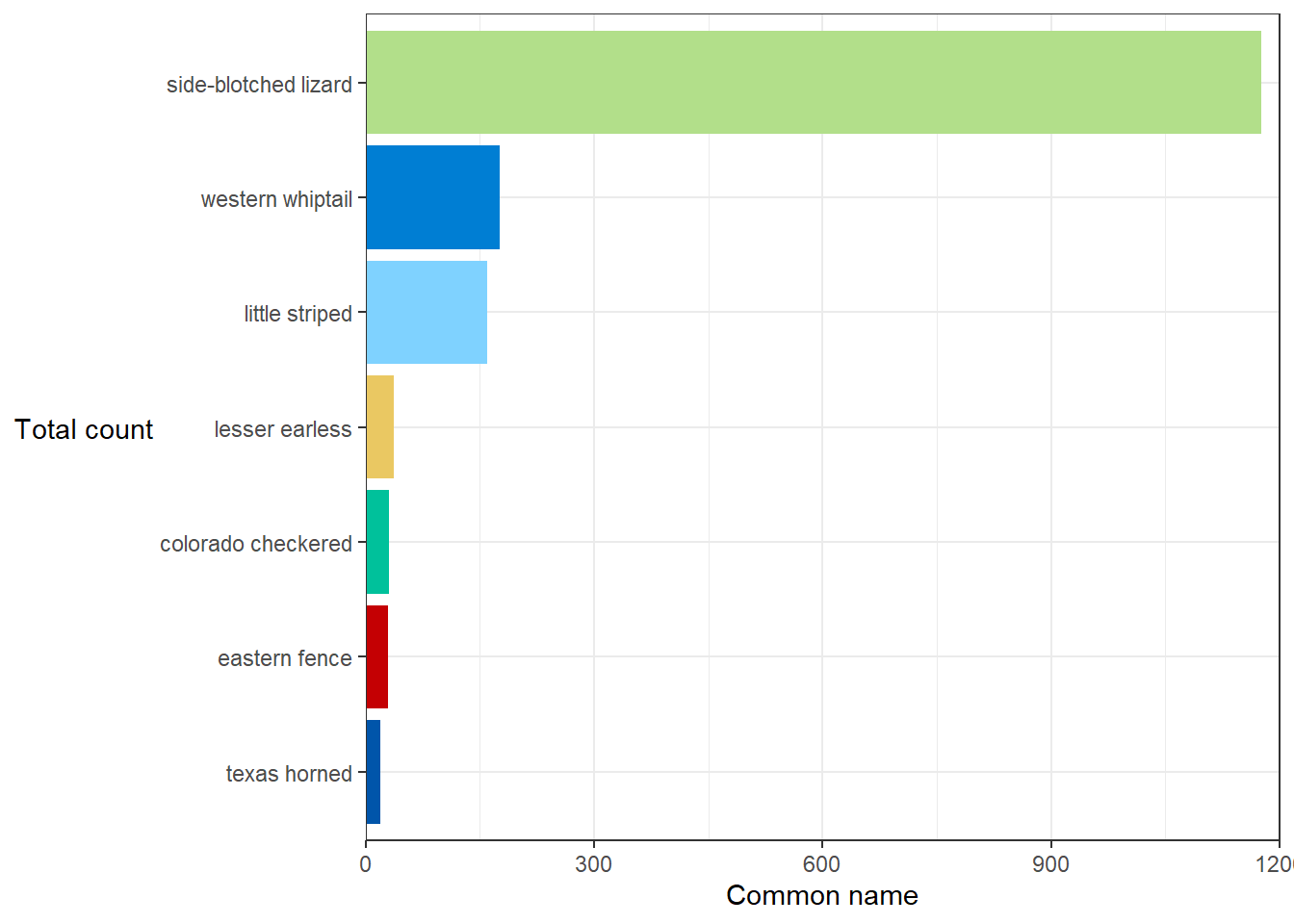
Find counts of lizard by species, reorder factor levels by count, update aesthetic by color (removing redundant legend), customize color using something from paletteer:
lizard_n <- lizards %>%
  count(common_name) %>%
  mutate(common_name = fct_reorder(common_name, n))
ggplot(data = lizard_n, aes(y = common_name, x = n)) +
  geom_col(aes(fill = common_name), show.legend = FALSE) +
  scale_fill_paletteer_d("tidyquant::tq_dark") +
  scale_x_continuous(expand = c(0,0), limits = c(0, 1200)) +
  theme_bw() +
  labs(x = "Common name",
       y = "Total count") +
  theme(axis.title.y = element_text(angle = 0, vjust = 0.5))
In the weeds of themes (gridlines, panel colors)
Ask yourself: do you need those gridlines? Only if your audience needs to know whether values are above or below meaningful values - which can be useful, but oftentimes gridlines are really overused and make an entire plot feel more cluttered.
We can update gridline frequency by changing breaks, but we may want to customize them in other ways, too.
p <- ggplot(data = lizards, aes(x = total_length, y = weight)) +
  geom_point()
p

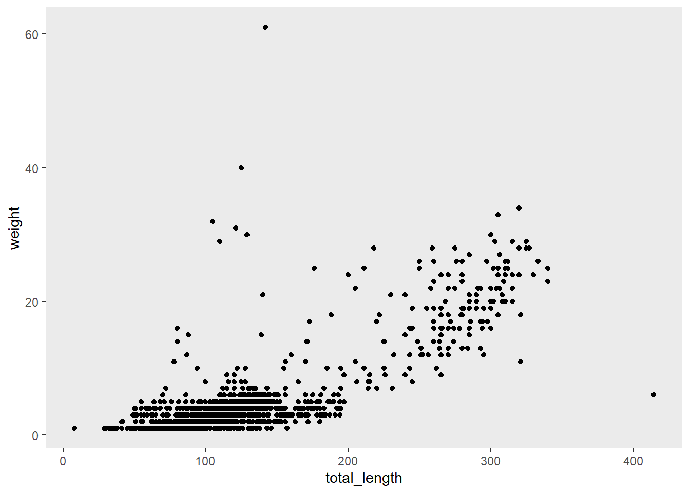
p +
  theme(panel.grid = element_blank()) # removes all gridlines (major & minor)
p +
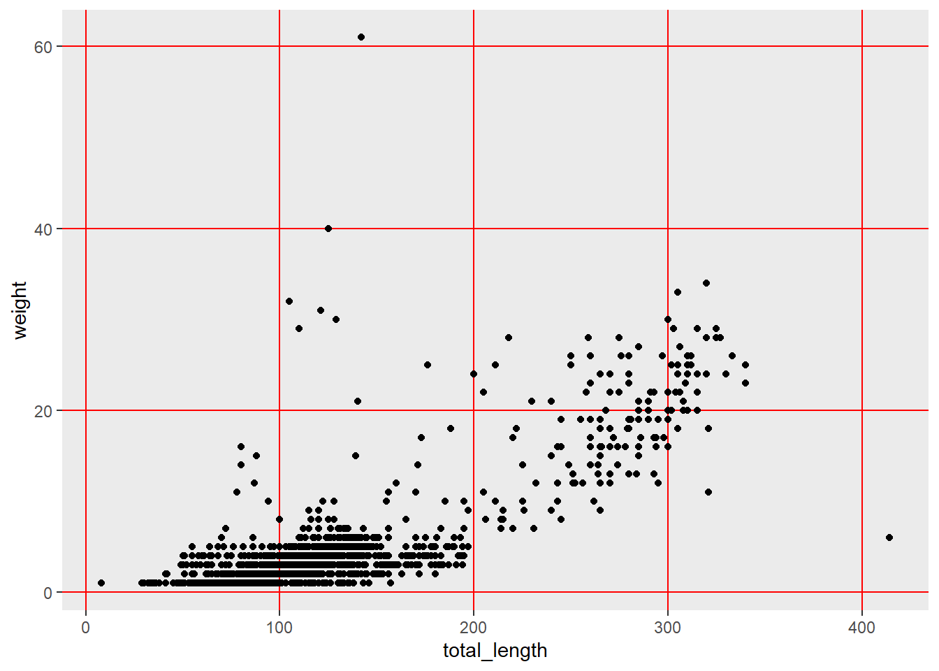
  theme(panel.grid.minor = element_blank(),
        panel.grid.major = element_line(color = "red"))
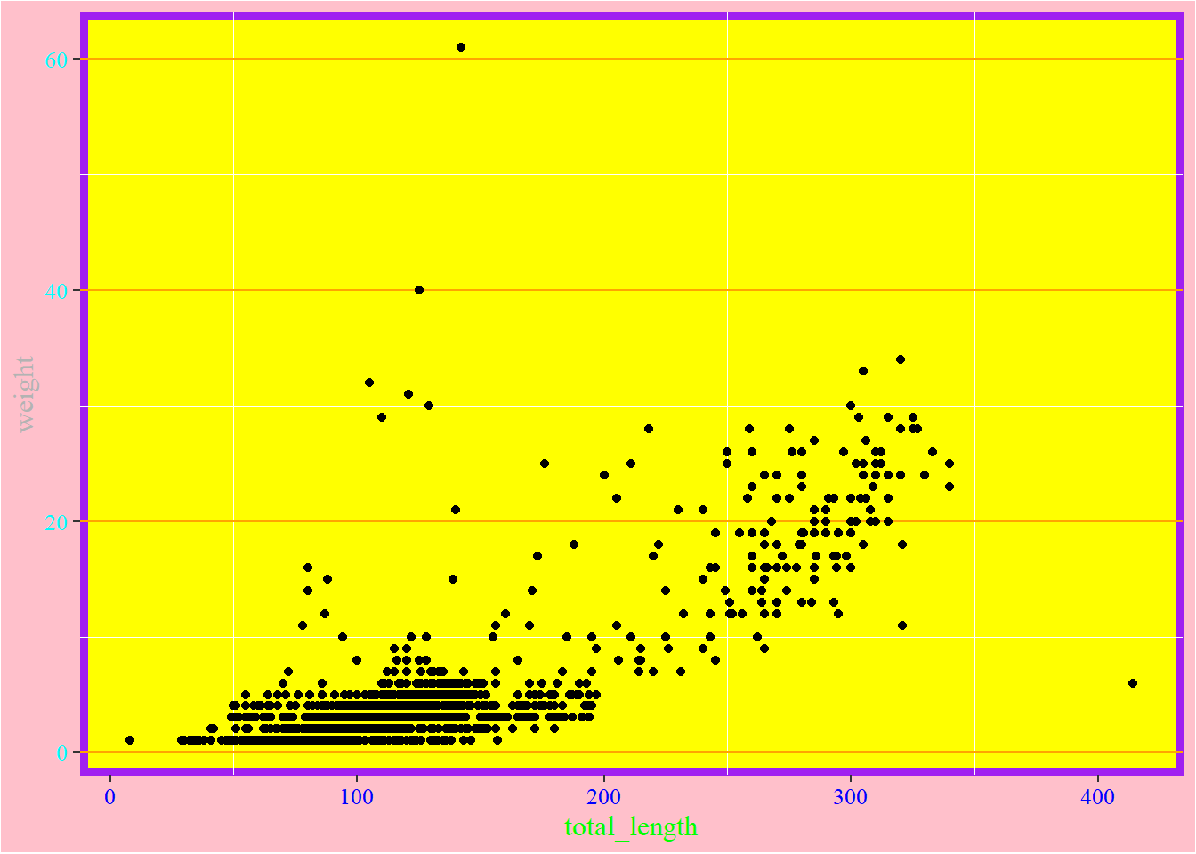
# Now let's just go bananas with some theme stuff:
p +
  theme(panel.background = element_rect(color = "purple", size = 3, fill = "yellow"),
        panel.grid.major.y = element_line(color = "orange"),
        panel.grid.major.x = element_blank(),
        axis.text.x = element_text(color = "blue"),
        axis.text.y = element_text(color = "cyan"),
        axis.title.x = element_text(color = "green"),
        axis.title.y = element_text(color = "gray70"),
        text = element_text(size = 12, family="serif"),
        plot.background = element_rect(fill = "pink"))
# Watch Kara Woo's talk from RStudio Conference 2021!
More fun with colors
There are a lot of options for colors in R. Color schemes can be very important for figures and are also a great way to have some fun.
Here are some useful resources that may help:
- The ggsci R package contains a collection of high-quality color palettes inspired by colors used in scientific journals, data visualization libraries, and more.
- There are even color palettes inspired by Beyonce and Wes Andersen movies.
- Other great resources include
Color Hexaand thecolortools package
Direct annotation and thresholds
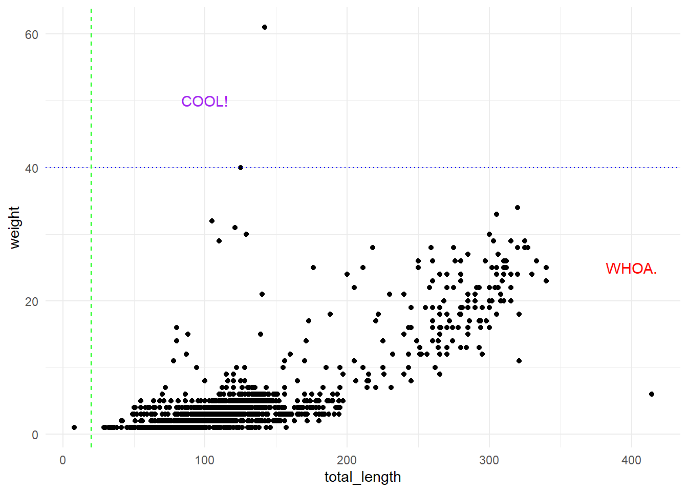
Legends are hard for audiences. Aligning values with important thresholds described in a figure captions is hard for audiences. It’s not always possible, but depending on your presentation and the audience, consider adding direct annotation and thresholds to plots.
We’ll do that with a few little tools:
annotate(): add annotation manually by locationgeom_hline(): add a horizontal linegeom_vline(): add a vertical line
p +
  annotate("text", x = 100, y = 50, label = "COOL!", color = "purple") +
  annotate("text", x = 400, y = 25, label = "WHOA.", color = "red") +
  geom_hline(yintercept = 40, linetype = "dotted", color = "blue") +
  geom_vline(xintercept = 20, linetype = "dashed", color = "green") +
  theme_minimal()
# Or, have the value be determined based on a variable:
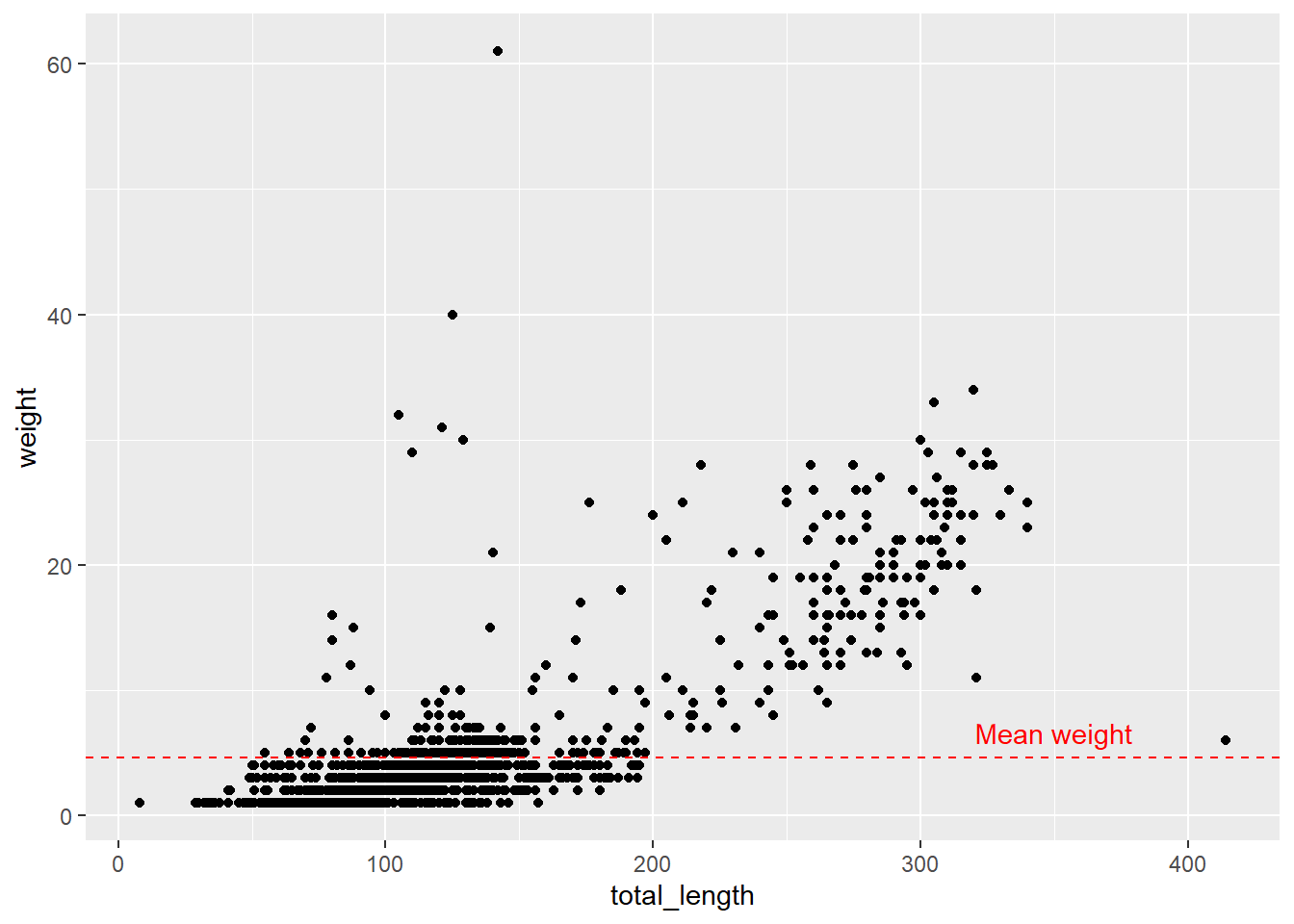
p +
  geom_hline(yintercept = mean(lizards$weight), linetype = "dashed", color = "red") +
  annotate("text", x = 350, y = mean(lizards$weight) + 2, label = "Mean weight", color = "red")
Add in some graphics if you want to be really fancy
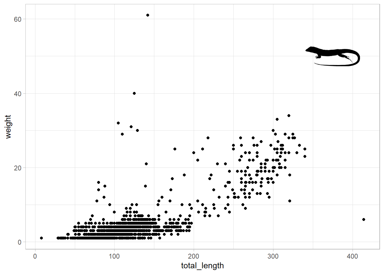
The rphylopic package is an easy way to add in some vector images.
library(rphylopic)
unique(lizards$scientific_name)
## [1] "cnemidophorus tigrisatus" "uta stansburiana"
## [3] "cnemidophorus tessalatus" "phrynosoma cornutum"
## [5] "holbrookia maculata"      "sceloporus undulatus"
## [7] "cnemidophorus inornatus"
lizard_pic <- name_search(text = "Cnemidophorus", options = "namebankID")[[1]] # find names
lizard_pic
## # A tibble: 6 x 2
##   uid                                  namebankID
##   <chr>                                <chr>
## 1 5b2409dc-9324-48a5-9cdf-a43089d01387 8065611
## 2 e1c226ae-9407-4495-ae19-276aa48ff387 8065676
## 3 1fd774e7-d3ac-41cf-8525-7c57716fe7c7 188156
## 4 c15d2473-53e5-4bbb-8574-fb9e36c838b7 8065613
## 5 3df2b352-7e58-4414-b71b-df6d8604cdf2 5744051
## 6 c83eebd5-c1e0-4a47-9b75-28950784606d 210527
lizard_id_all <- name_images(uuid = lizard_pic$uid[1])  # list images
lizard_id_all
## $other
## list()
##
## $supertaxa
## $supertaxa[[1]]
## $supertaxa[[1]]$uid
## [1] "97fd34d9-c361-4cb5-b282-254eed08de5f"
##
##
##
## $subtaxa
## list()
##
## $same
## list()
lizard_id <- name_images(uuid = lizard_pic$uid[1])$supertaxa[[1]]$uid  # get individual image id
lizard_id
## [1] "97fd34d9-c361-4cb5-b282-254eed08de5f"
lizard_image <- image_data(lizard_id, size = 256)[[1]] # get actual icon, define size. Don't run this alone
p+add_phylopic(lizard_image, alpha = 1, x = 375, y = 50, ysize = 25) +
  theme_light()
Note that you can also load in ‘IAN symbol library’ graphics and use them in R plots
Apply what we’ve learned to something new!
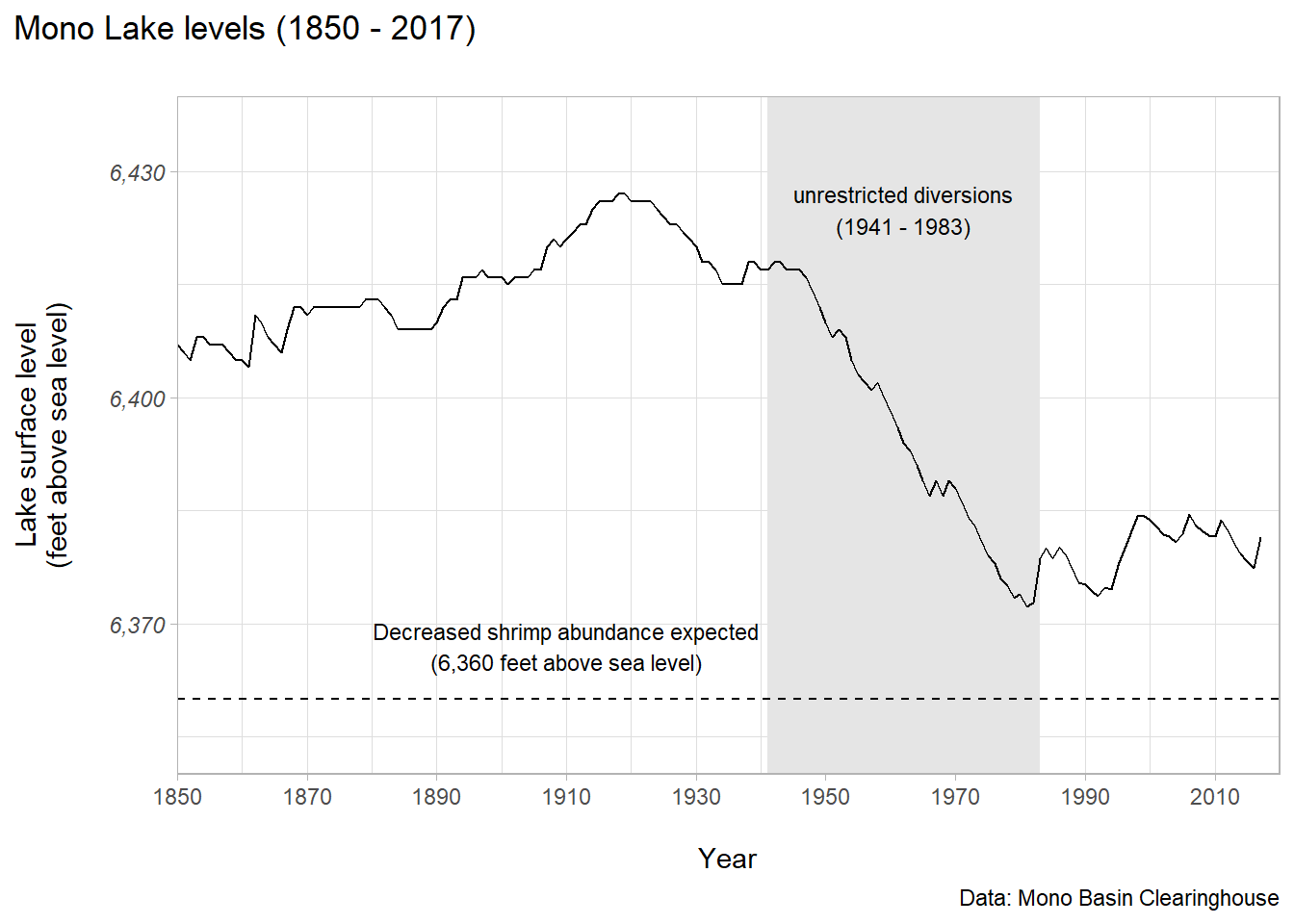
This data is from the Mono Basin Clearinghouse, and contains lake level (feet above sea level) for Mono Lake - a terminal saline lake in eastern California.
Here are some important things to know when considering how to make our data viz:
- LA Department of Water & Power took water unrestricted from streams feeding into Mono Lake starting in 1941
- Unrestricted water diversions continued until the landmark 1983 California Supreme Court decision, led by the Mono Lake Committee, that “The public trust … is an affirmation of the duty of the state to protect the people’s common heritage of streams, lakes, marshlands and tidelands…”
- From The Mono Basin Ecosystem: Effects of Changing Lake Level, published in 1987 by the Mono Basin Ecosystem Study Committee, Board on Environmental Studies and Toxicology: “If the lake fell to levels at which the birds’ food sources were adversely affected, the bird populations would be reduced. The decrease in availability of brine shrimp for food would begin to affect those birds relying on them – eared grebes and California gulls – at a salinity of 120 g/L (lake level of 6360 ft).”
# Read in the data:
mono <- read_csv("mono.csv")
lake_plot<-ggplot(data = mono, aes(x = year, y = lake_level)) +
  geom_rect(aes(xmin = 1941,
                xmax = 1983,
                ymin = 6350,
                ymax = 6440),
            fill = "gray90") +
  geom_line() +
  labs(x = "\nYear",
       y = "Lake surface level\n(feet above sea level)\n",
       title = "Mono Lake levels (1850 - 2017)\n",
       caption = "Data: Mono Basin Clearinghouse") +
  scale_x_continuous(limits = c(1850, 2020),
                     expand = c(0,0),
                     breaks = seq(1850, 2010, by = 20)) +
  scale_y_continuous(limits = c(6350, 6440),
                     breaks = c(6370, 6400, 6430),
                     expand = c(0,0),
                     labels = scales::label_comma()) +
  annotate("text", x = 1962, y = 6425,
           label = "unrestricted diversions\n(1941 - 1983)",
           size = 3) +
  theme_light() +
  theme(plot.title.position = "plot",
        axis.text.y = element_text(face = "italic")) +
  geom_hline(yintercept = 6360, linetype = "dashed") +
  annotate("text",
           x = 1910,
           y = 6367,
           label = "Decreased shrimp abundance expected\n(6,360 feet above sea level)",
           size = 3)
lake_plot
shrimp <- name_search(text = "Shrimp", options = "namebankID")[[1]] # find names
shrimp_id_all <- name_images(uuid = shrimp$uid[1])  # list images
shrimp_id <- name_images(uuid = shrimp$uid[1])$same[[1]]$uid  # get individual image id
shrimp_image<-image_data(shrimp_id, size = 256)[[1]] # get actual icon, define size. Don't run this alone
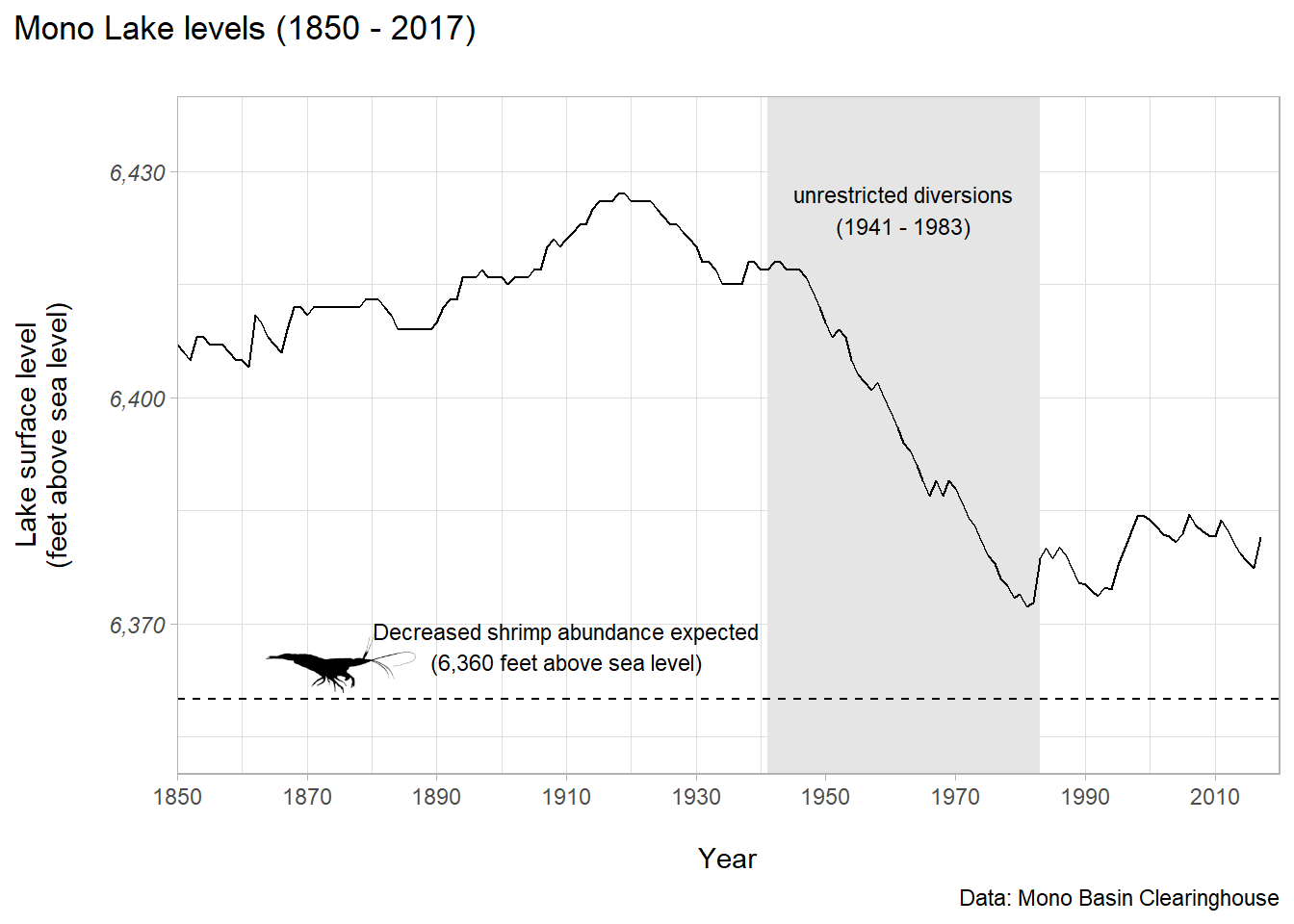
lake_plot + add_phylopic(shrimp_image, alpha = 1, x = 1875, y = 6365, ysize = 10)
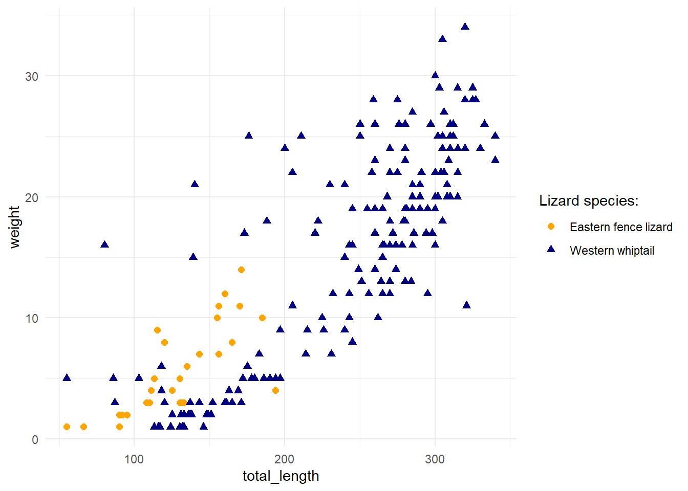
Aside: better legends
two_lizards <- lizards %>%
  filter(common_name %in% c("eastern fence", "western whiptail"))
two_lizards_plot<-ggplot(data = two_lizards, aes(x = total_length, y = weight)) +
  geom_point(aes(color = common_name,
                 shape = common_name),
             size = 2) +
  scale_color_manual(name = "Lizard species:",
                       values = c("orange", "navy"),
                     labels = c("Eastern fence lizard", "Western whiptail")) +
  scale_shape_discrete(name = "Lizard species:",
                       labels = c("Eastern fence lizard", "Western whiptail")) +
  theme_minimal()
two_lizards_plot
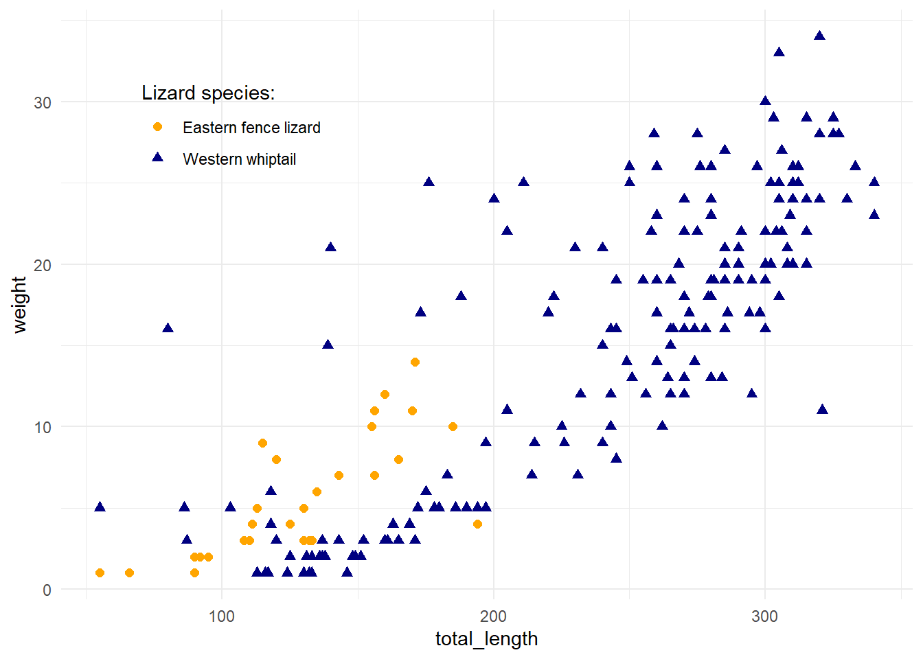
You can move the legend inside of the figure, if appropriate
two_lizards_plot +
  theme(legend.position = c(0.2, 0.8),
        legend.background = element_blank()) # And check out other legend.* options...it's a lot.
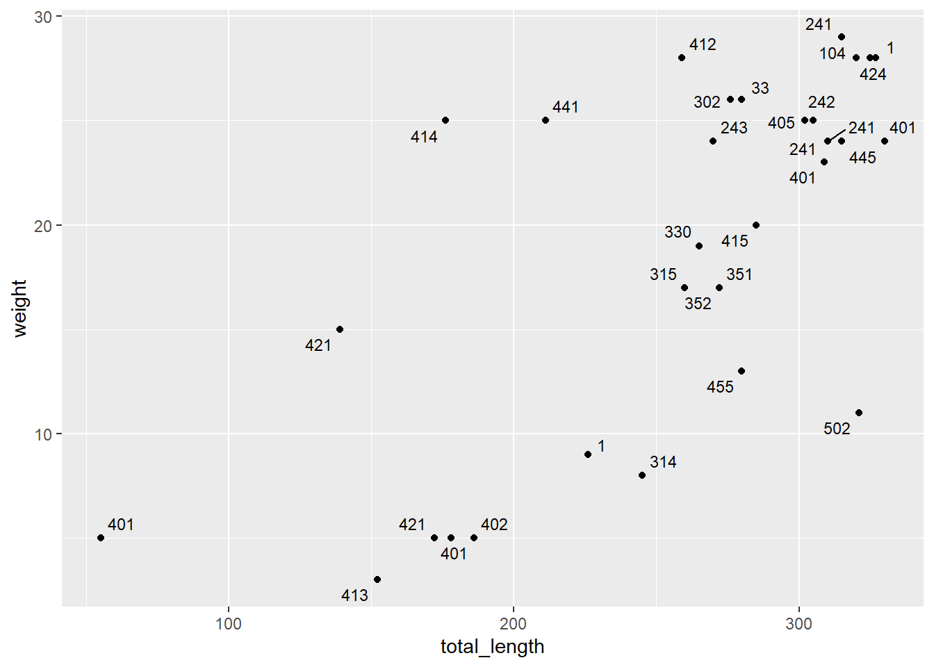
Repulsive labels (e.g. ggrepel)
Direct labeling with a bunch of groups is challenging - ggrepel is here to help! It makes automatic repulsive labels. Let’s make a subset of Western Whiptails at the “sand” site, then add repulsive labels by toe number.
wwc_lizards <- lizards %>%
  filter(common_name =="western whiptail", site == "sand")
ggplot(data = wwc_lizards, aes(x = total_length, y = weight)) +
  geom_point() +
  geom_text_repel(aes(label = toe_num), size = 3, max.overlaps = 20, show.legend = FALSE)
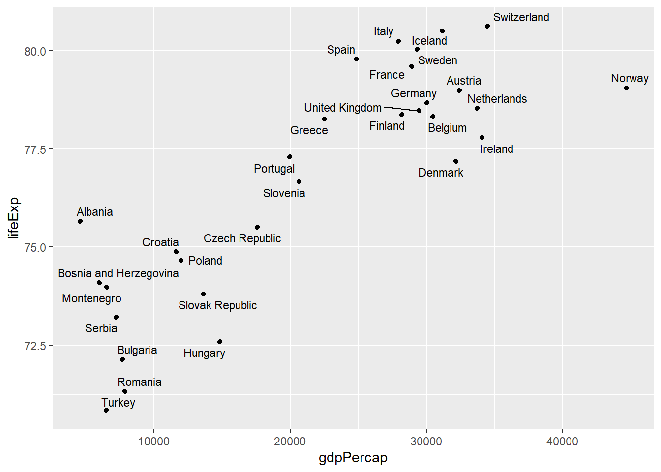
Let’s try it with a different dataset, gapminder (“Excerpt of the Gapminder data on life expectancy, GDP per capita, and population by country.")
gapminder %>%
  filter(year == 2002, continent == "Europe") %>%
  ggplot(aes(x = gdpPercap, y = lifeExp)) +
  geom_point() +
  geom_text_repel(aes(label = country), size = 3)
Highlighting for clarity (e.g. with gghighlight)
This can be particularly useful if you have made a bunch of observations or series, and you want to highlight some to make your audience’s life easier.
Add gghighlight() to your ggplot to specify highlighting conditions.
Let’s look at what our plot was before
p

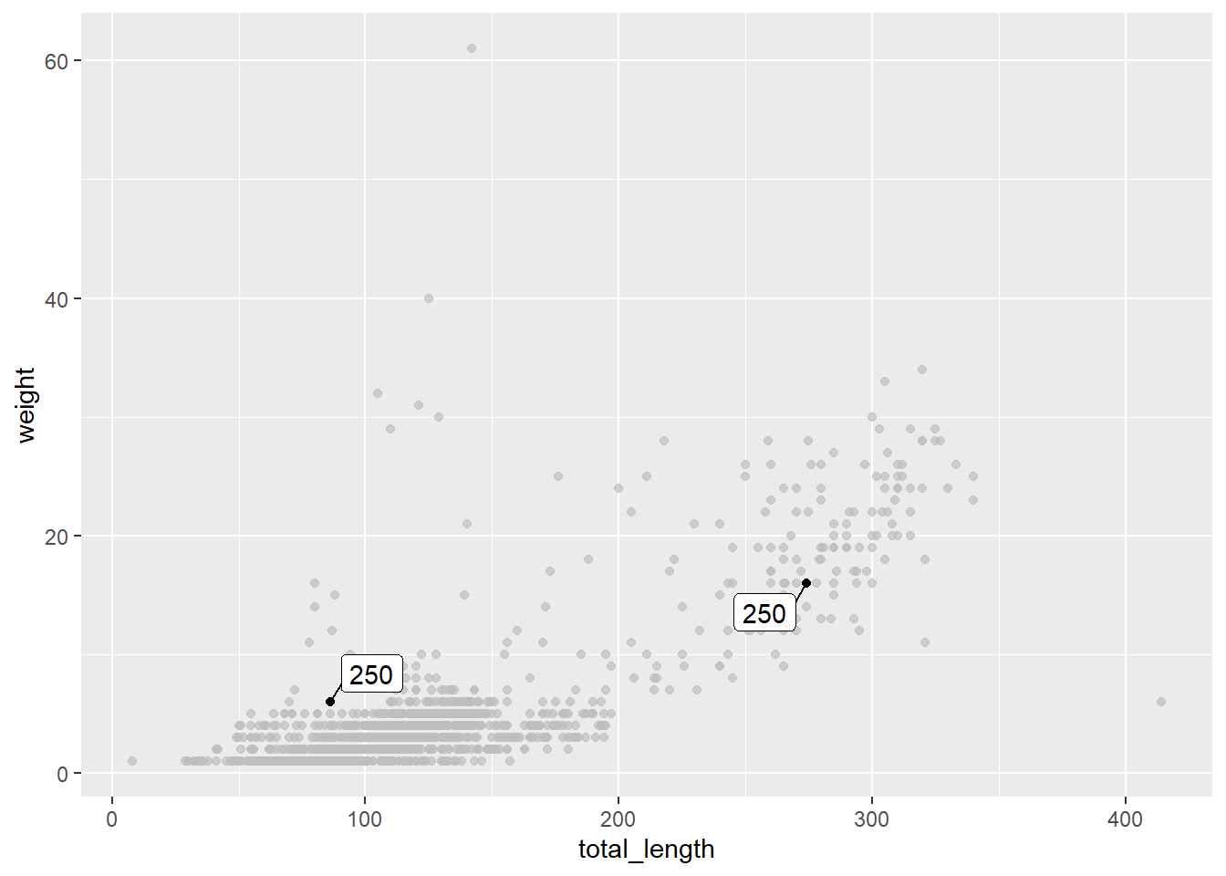
Let’s highlight toe marker number value equal to 250
p +
  gghighlight(toe_num == 250, label_key = toe_num)
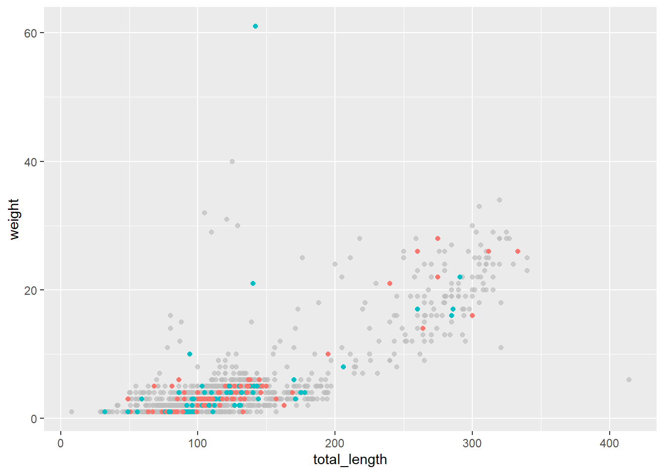
Now let’s highlight two of the sites
p +
  aes(color = site) + # Best to include this in geom_ line instead of here...
  gghighlight(site %in% c("cali", "grav"))
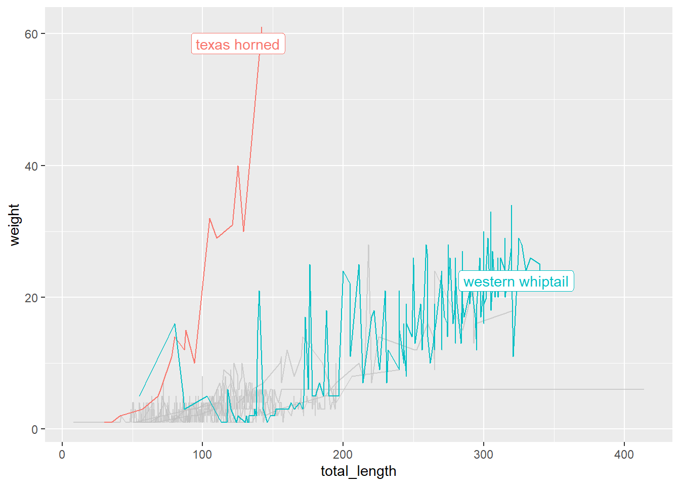
# One more example:
q <- ggplot(data = lizards, aes(x = total_length, y = weight, group = common_name)) +
  geom_line(aes(color = common_name)) +
  gghighlight(max(weight, na.rm = TRUE) > 30)
q
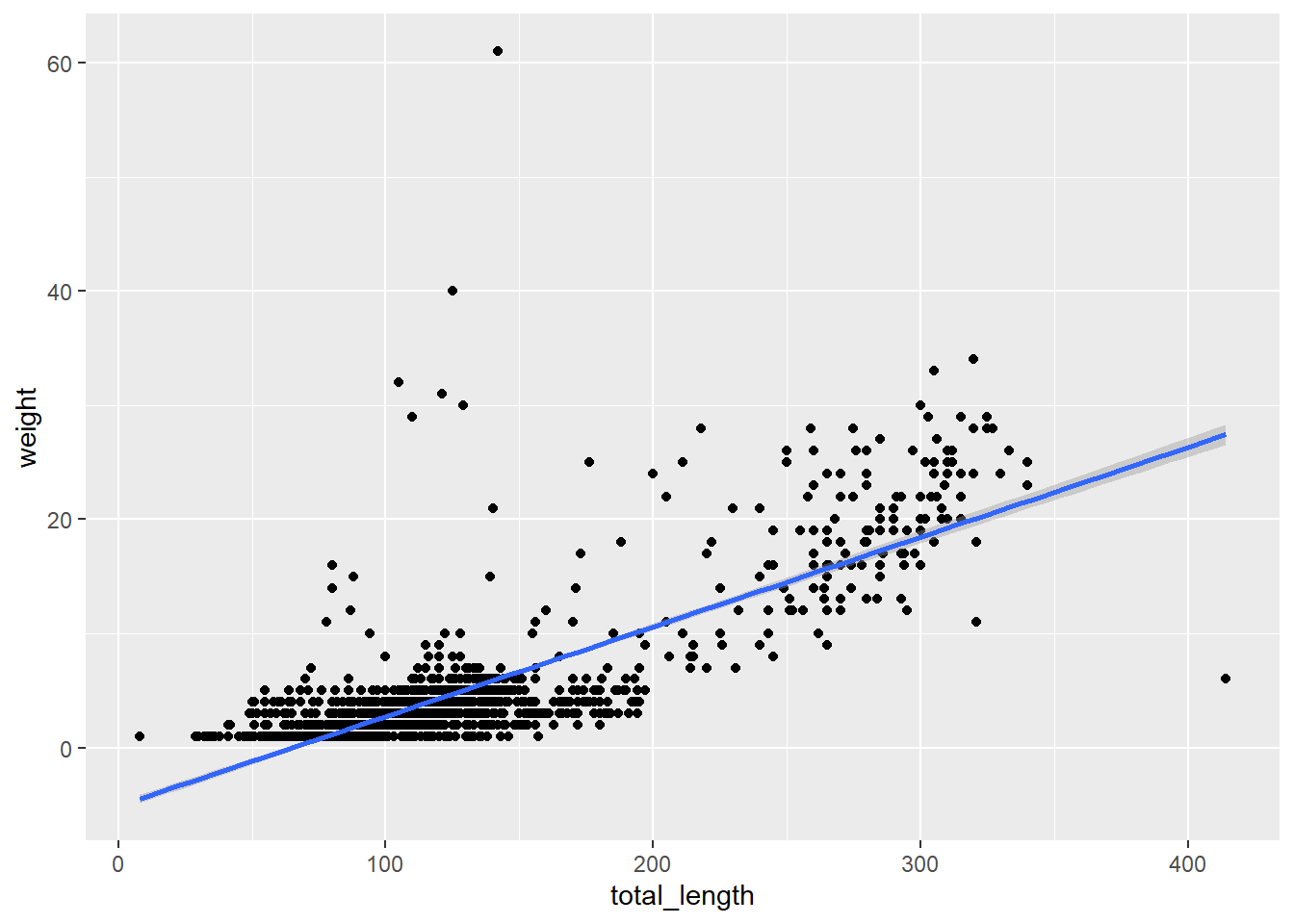
Another aside: trend lines!
p +
  geom_smooth(method = "lm", se = TRUE)
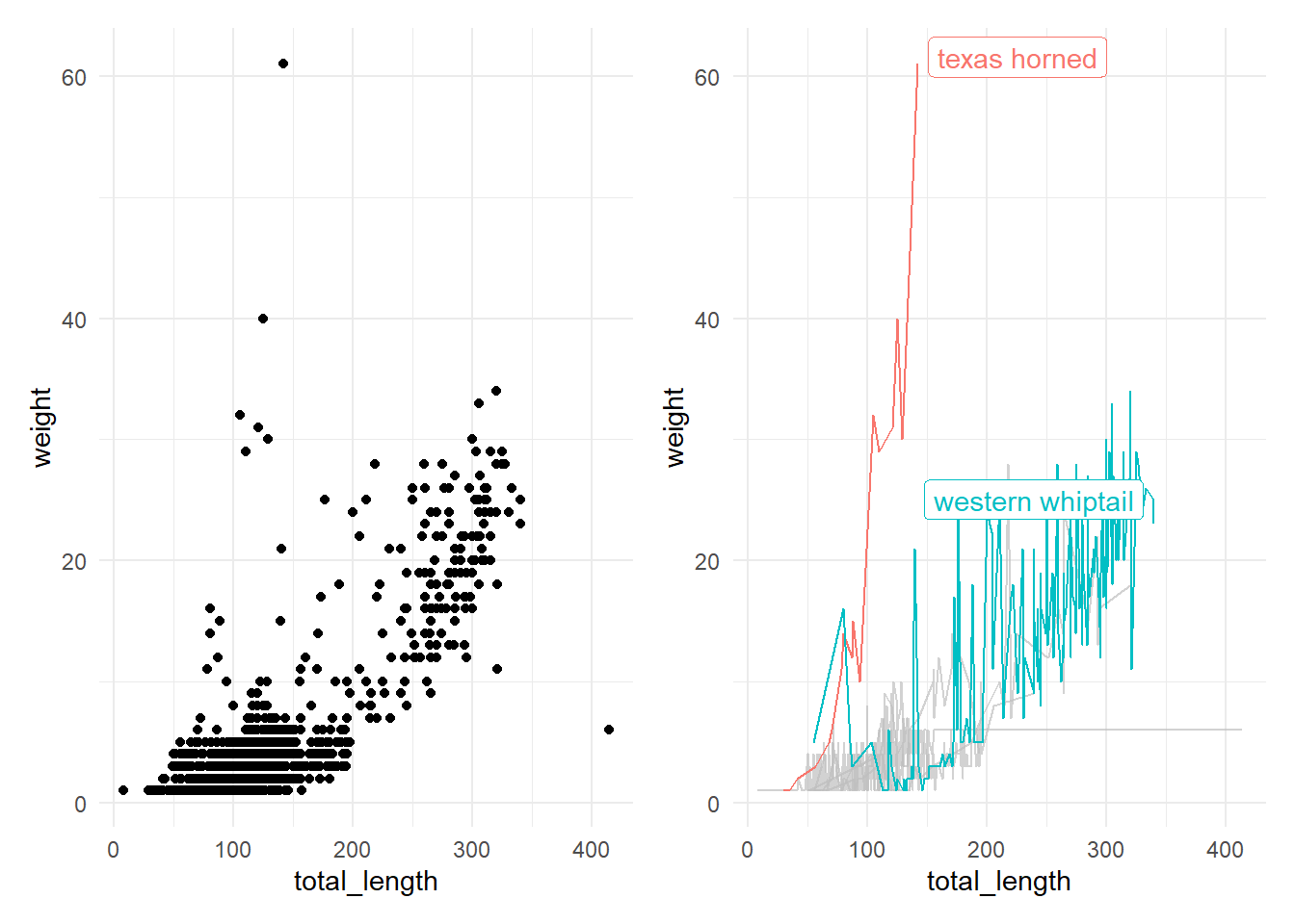
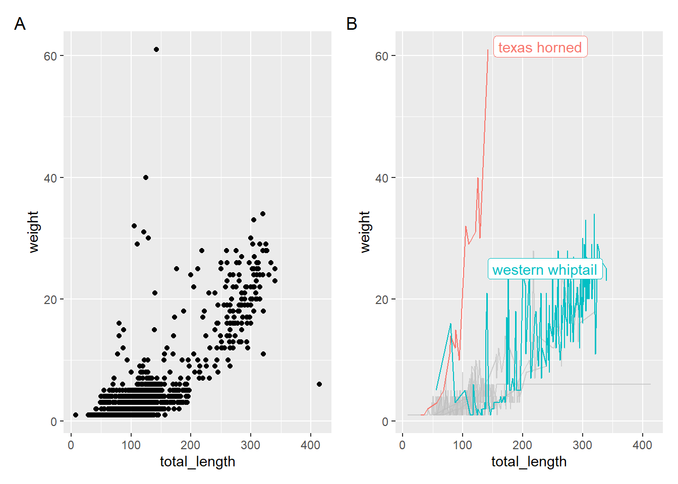
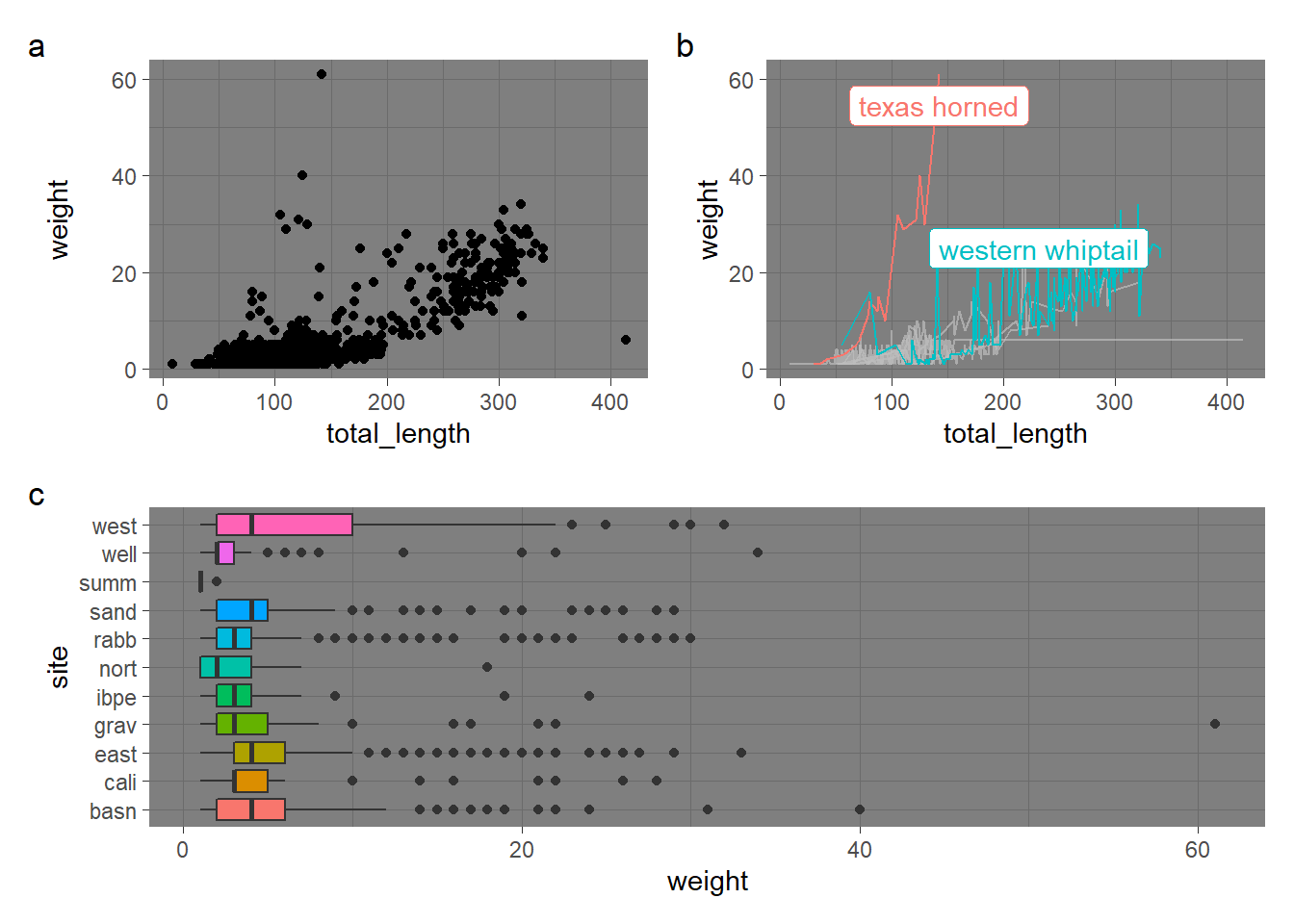
Compound figures with patchwork
Patchwork makes it easier to put multiple figures together into a single graphic – and to do some efficient theming while you’re at it.
Let’s store a couple of different graphs (we already have p and q stored):
(p | q) & # & means it's applied to both plots!
  theme_minimal()
p+q+plot_annotation(tag_levels = "A")
z <- ggplot(data = lizards, aes(y = site, x = weight)) +
  geom_boxplot(aes(fill = site), show.legend = FALSE)
# Put them all together using PEMDAS structure
((p | q) / z) + plot_annotation(tag_levels = "a") & theme_dark()
Explore some new graph types
Marginal plots
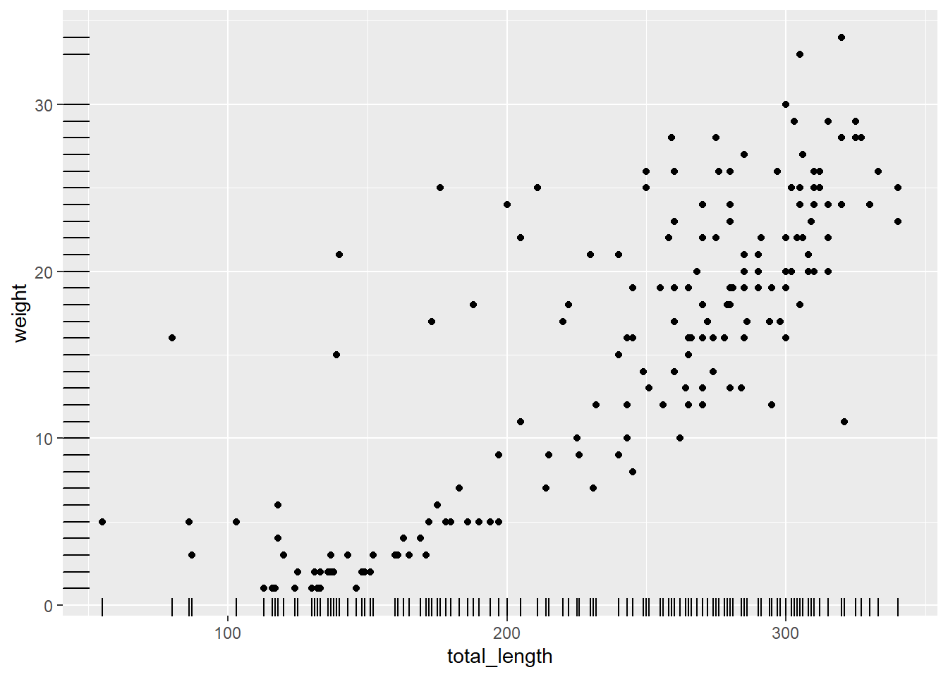
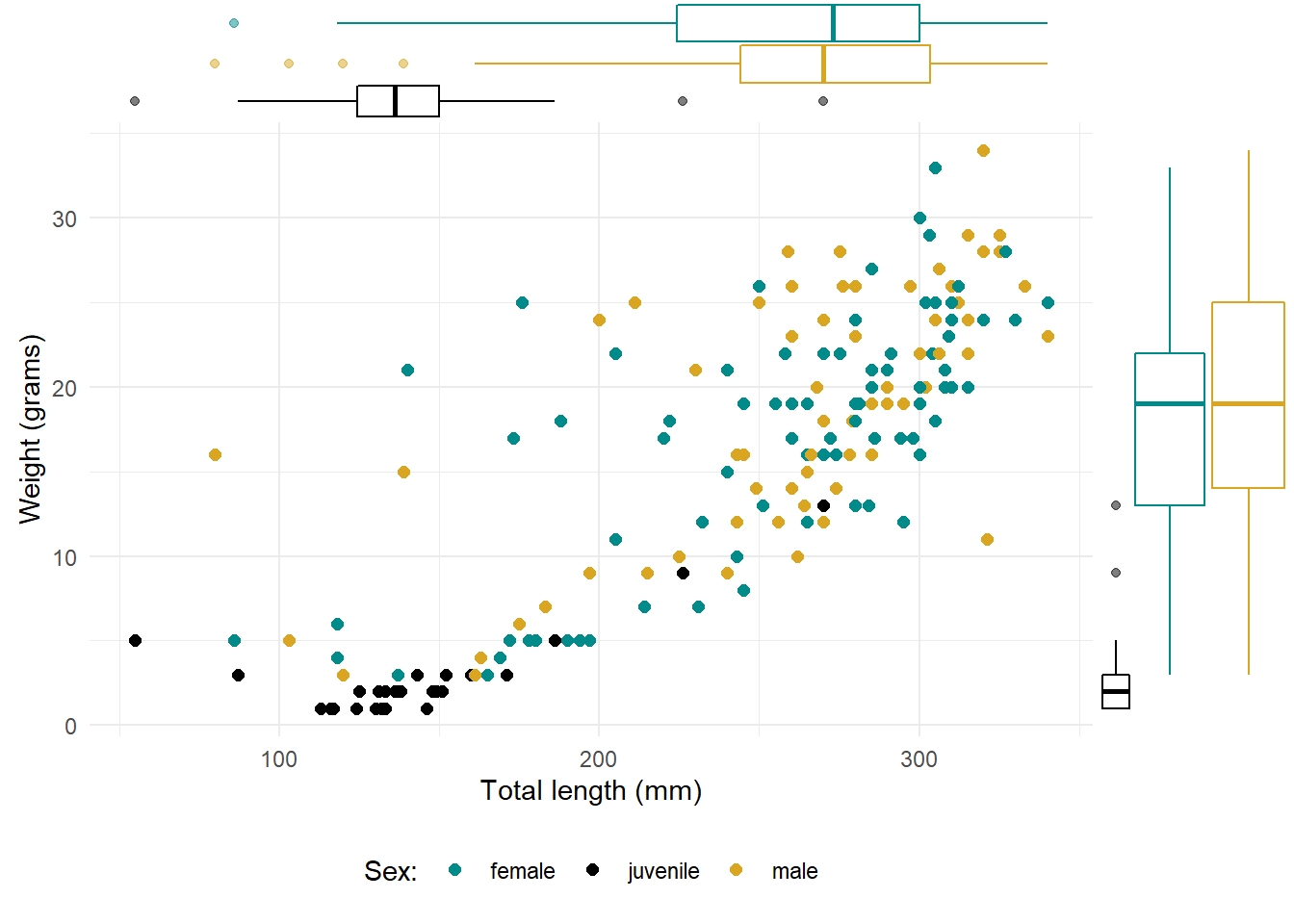
A rug plot is a compact visualisation designed to supplement a 2d display with the two 1d marginal distributions. Rug plots display individual cases so are best used with smaller datasets.
whiptails <- lizards %>%
  filter(common_name == "western whiptail") %>%
  drop_na(total_length, weight)
# An issue with rug plots:
ggplot(data = whiptails, aes(x = total_length, y = weight)) +
  geom_point() +
  geom_rug()
p <- ggplot(data = whiptails, aes(x = total_length, y = weight)) +
  geom_point(aes(color = sex), size = 2) +
  theme_minimal() +
  scale_color_manual(values = c("cyan4", "black", "goldenrod"),
                     name = "Sex:",
                     labels = c("female", "juvenile", "male")
  ) +
  theme(legend.position = "bottom") +
  labs(x = "Total length (mm)",
       y = "Weight (grams)")
# Example 1: A histogram
# ggMarginal(p, type = "histogram", fill = "gray60", color = NA)
# Example 2: A boxplot, grouped by sex (as in the plot)
ggMarginal(p, type = "boxplot", groupColour = TRUE)
A beeswarm plot with ggbeeswarm
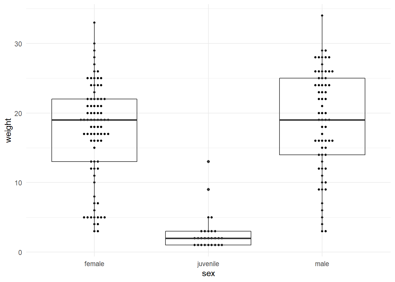
ggplot(data = whiptails, aes(x = sex, y = weight)) +
  geom_beeswarm(size = 1) +
  geom_boxplot(fill = NA) +
  scale_x_discrete(labels = c("female","juvenile","male")) +
  theme_minimal()
A heatmap with geom_tile()
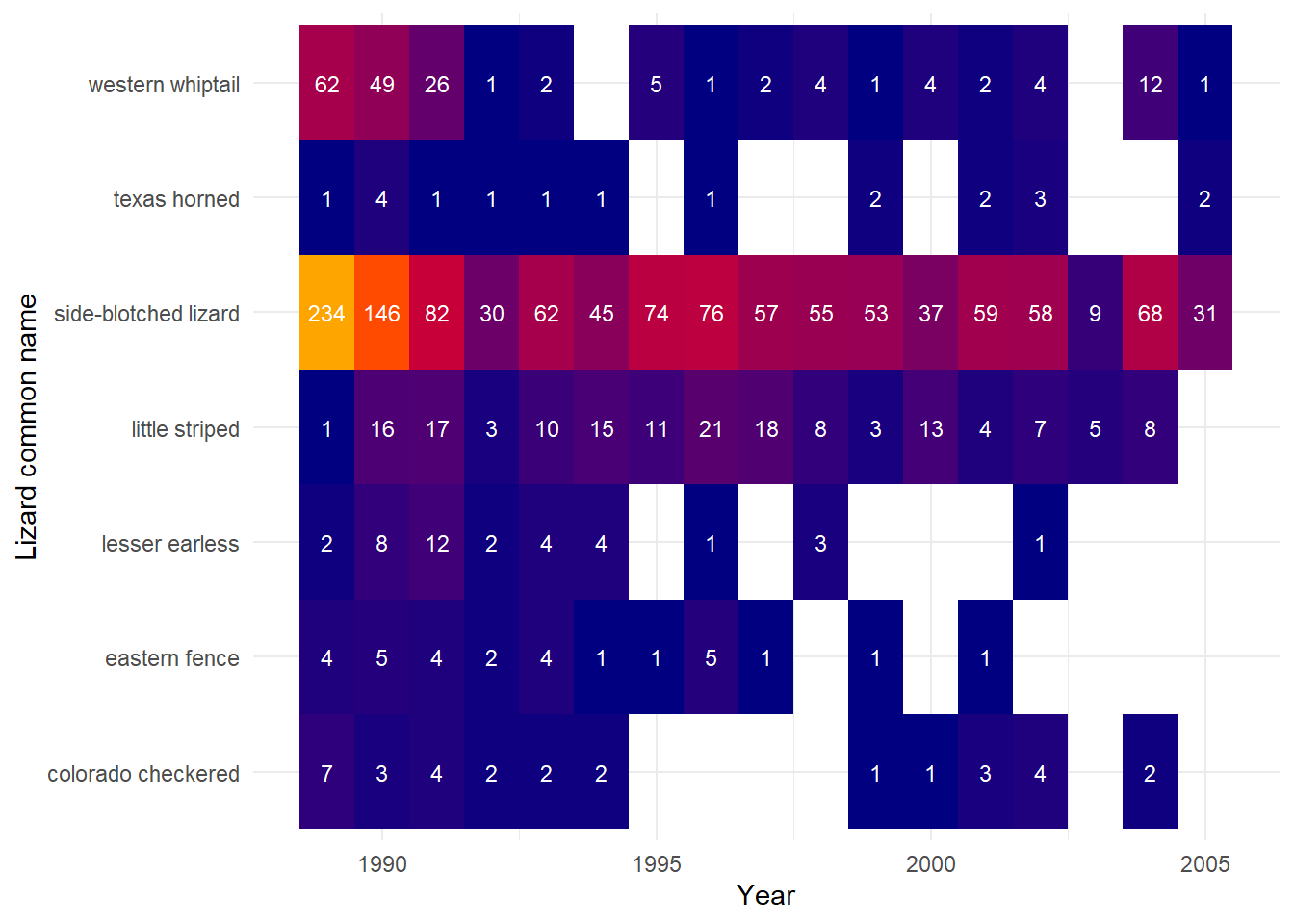
Heatmaps are a great way to see trends across groups. Here, we’ll create one to visualize lizard counts by species and site.
# Get the counts:
lizard_counts <- lizards %>%
  mutate(date = lubridate::mdy(date)) %>%
  count(year = lubridate::year(date), common_name) %>%
  drop_na()
# Make a heatmap of counts:
ggplot(data = lizard_counts, aes(x = year, y = common_name)) +
  geom_tile(aes(fill = n), show.legend = FALSE) +
  geom_text(aes(label = n), color = "white", size = 3) +
  scale_fill_gradientn(colors = c("navy","red","orange")) +
  theme_minimal() +
  labs(x = "Year", y = "Lizard common name")
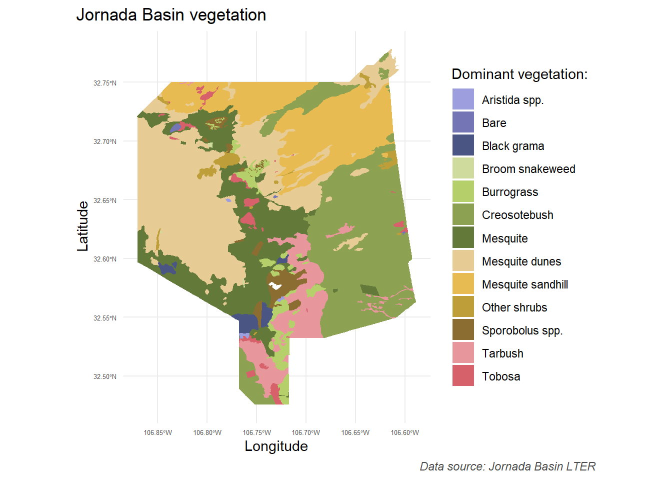
Make a map!
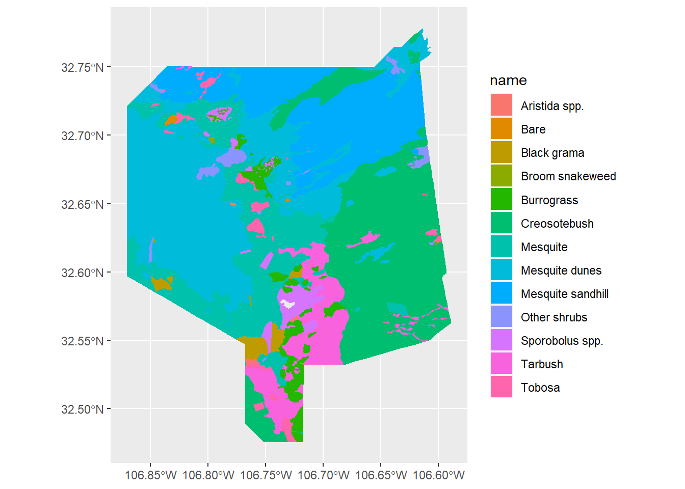
Let’s make a map using some of the skills we’ve learned to customize our ggplots:
# First, read in the Jornada Basin vegetation data:
jornada_veg <- read_sf("spatial_vegetation/doc.kml") %>% dplyr::select(Name) %>%
  clean_names()
# Initial exploratory plot (one plot per attribute)
# plot(jornada_veg)
# Remember, you can see the paletteer palettes with:
# View(palettes_c_names)
# View(palettes_d_names)
ggplot() +
  geom_sf(data = jornada_veg,
          aes(fill = name),
          color = NA)
# For next year: how would you change increments of lat / lon on x & y axis? See coord_map()
ggplot() +
  geom_sf(data = jornada_veg,
          aes(fill = name),
          color = NA) +
  theme_minimal() +
  scale_fill_paletteer_d(palette = "ggthemes::manyeys") +
  labs(x = "Longitude",
       y = "Latitude",
       fill = "Dominant vegetation:",
       title = "Jornada Basin vegetation",
       caption = "Data source: Jornada Basin LTER") +
  theme(legend.position = "right",
        plot.title.position = "plot",
        plot.caption.position = "plot",
        plot.caption = element_text(face = "italic", color = "gray30"),
        axis.text = element_text(size = 5))
Export your graphs & figures
Use ggsave() to export your figures, setting the dimensions, dpi, and more. The default in ggsave() is to save “the last plot that you displayed, using the size of the current graphics device.”
See ?ggsave for documentation.
ggsave(filename = "file_name.png", width = 6, height = 4, dpi = 300)
Learn more
Here are some great resources for building advanced data visualization tools in ggplot2, learning about new types of graphs, and choosing an appropriate graph type:
Books
-
Claus Wilke’s Fundamentals of Data Visualization
-
Kieran Healy’s Data Visualization